PORTFOLIO
/
EKAHAL ASSIGNMENT
/
B2B SAAS DESIGN
B2B SaaS
Travel & Activity Booking Platform
Operator Tools

ROLE
Product Designer
ASSIGNMENT
Redesign one flow/screen of the backend dashboard
focus
Qualitative Research, Information Architecture, Flow fixing
timeline
2-Days Sprint
Om Prakash Kumar runs his adventure tour business the way most small operators do WhatsApp, phone calls, and a notebook.
01 — THE REALITY
Confusing navigation
Activity Listing sits 4th, buried under items that mean nothing to a brand-new operator.
Dead zero-state dashboard
Empty charts and a payment-anxiety banner, with zero guidance on what to do first.
Overwhelming 9-step activity creation
40+ fields, no smart defaults, no way to save a draft and come back.
Limited website customization
Just a color picker and a font selector no templates, no real page builder.

A day in Om's life
He opens Advensure for the first time, hoping to get his rafting and paragliding tours online before peak season.
He lands on a dashboard that's completely empty ₹0.00 everywhere, a red banner demanding he set up payments before he's even added an activity, and a “0 Bookings to confirm” line that tells him nothing about what to do next.
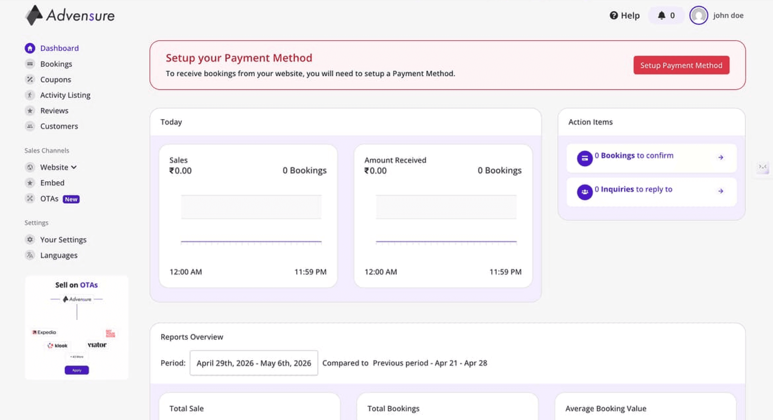
The real demo account on first login ₹0.00 charts, a red payment banner, and two zero-count action items.
He clicks into the sidebar looking for where to list his first tour. “Activity Listing” is buried fourth, below Bookings and Coupons line items that mean nothing to him yet, because he has nothing to sell on the platform.
He finds it. Then hits a 9-step form asking about booking windows, inquiry settings, and slot configuration before he's even finished naming his first activity. There's no way to save what he's started and come back later.
He gives up at step 5 and goes back to WhatsApp.

Step 1 of 9 in the live form name and location sit on the same screen as slot limits, booking windows, and inquiry settings.
02 — THE ROOT CAUSE
03 — DESIGN PRINCIPLES
01
Time-to-first-activity over feature completeness
Every screen is judged by how fast it gets a brand-new operator to a published, bookable activity.
02
Progressive disclosure, not feature removal
Advanced settings (booking windows, inquiry options, group pricing) still exist they just don't block step one.
03
Guide, don't assume
A first-time login should never look identical to a returning power user's dashboard.
04 — INFORMATION ARCHITECTURE
BEFORE
A flat list mixing core business actions with marketing tools
Dashboard
Bookings
Coupons
Activity Listing
4th
Reviews
Customers
Website
Embed
OTAs
NEW
AFTER
Grouped by what the operator is trying to do
BUSINESS
Dashboard
Bookings
Activities
3rd · promoted
Customers
MARKETING
Coupons
Reviews
SALES CHANNELS
Website
Embed
OTA Connect
Why this structure?
An operator's first session is entirely “Business.” Marketing and Sales Channel tools matter once there's something to promote not before. Grouping by intent, not alphabetically or by build order, means the nav teaches the product's priorities instead of hiding them.

The grouped sidebar in the redesign, introduced item by item by the first-login product tour.
05 — DESIGN DECISION
THE PROBLEM
New users landed on empty ₹0.00 charts with meaningless axis labels, a “0 Bookings to confirm” item with no call to action, and a red payment-setup banner creating anxiety before there was anything to get paid for. 40–60% abandoned after their first login.
THE FIX
A “Welcome to Advensure! Let's get you set up” checklist Create first activity → Setup payment method → Customize website with a visible progress bar, replacing the dead empty state entirely. Paired with a first-login product tour that walks the nav item by item, so the sidebar groupings are explained, not just relabeled.
WHY THIS WORKS
Om doesn't need to interpret an empty chart. He needs to be told, in order, what unlocks bookings. The checklist replaces ambiguity with sequence.

Once there's real data: checklist at 1/3, Action Required with counts that matter, then today's numbers — in that order.

Redesigned zero state — the checklist is the page, not a banner on top of it.

The first-login product tour, one nav item at a time, skippable at any point.
06 — DESIGN DECISION
THE PROBLEM
Adding one activity took 9 separate screens and 40+ fields. Step 1 alone mixed basic info (name, location) with advanced configuration (booking windows, inquiry settings, slot limits). There were no smart defaults, and nothing could be saved as a draft it was all-or- nothing. Most operators quit around step 4–5.
THE FIX
Collapsed to 3 focused steps Basic Details, Availability & Scheduling, Pricing & Policies with smart defaults doing the work that used to require manual configuration (like auto- generating the listing URL instead of asking for it).
WHY THIS WORKS
Om needs to publish one rafting tour, not configure an enterprise booking engine. Everything that isn't required to go live moves to “edit later,” not “step 4 of 9.”
EVIDENCE — THE LIVE 9-STEP FORM

Step 1 of 9 — basics mixed with slots, booking windows, inquiry settings

Ticket setup — slot blocking, ticket limits, group pricing, before publishing anything

Step 7 of 9 — media uploads, six steps after he started
THE REDESIGNED 3-STEP FLOW

Step 1 — Basic Details. Everything needed to describe the tour, plus a persistent “Save as Draft.”

Step 2 — Availability & Scheduling.

Step 3 — Pricing & Policies, then publish.
07 — DESIGN DECISION
THE PROBLEM
The “Website” section offered a color picker and a font selector nothing else. No templates, no page builder, no section editor, no domain management, and OTA integrations buried under a disconnected “Sales Channels” area instead of living where a website is actually being built.
THE FIX
WHY THIS WORKS
Om's biggest complaint wasn't styling it was that he had no professional presence to compete with. A template gets him from zero to a credible booking page in minutes, not a blank canvas.

Pages & Templates — page list, four travel-optimized templates, and theme controls in one place.

Website Editor — live preview of the active template with section-level customization.
08 — THE FINISHED PRODUCT
One screen: a setup checklist that disappears once complete, a nav that groups by what he's actually trying to do, and a path from signup to his first published activity that doesn't require 9 steps of configuration before he sees any payoff.

09 — DESIGN SYSTEM
COMPONENTS

& shadcn
Cards, steppers, badges, inputs retinted to Advensure's purple.
COLORS

Advensure's own brand purple, sampled directly from
the product.
10 — CONSTRAINTS
WHAT THAT MEANT
No user interviews Om Prakash's pain points are drawn from the brief and the platform's own demo content, not primary research
No usability testing with real operators
One flow chosen (the dashboard) over the marketing website, since it's the higher-leverage first-time-user problem
WHAT I PRIORITIZED
Time-to-first-activity: navigation, onboarding, and the activity creation flow
A believable first pass at the website builder gap
WHAT I DEPRIORITIZED
The HCP-style mobile app equivalent (a guide-facing mobile view)
OTA connection flow redesign
Full design-system documentation beyond what's shown here
11 — IMPACT
8 min → under 2 min
Time-to-first-activity-creation
25% → 80% (target)
Activation rate - first activity + payment + published website
32% → 85% (target)
Activity creation completion rate
12% → 70% (target)
Users publishing a customized website
12 — WHAT I'D DO NEXT
A lighter mobile experience
Om Prakash is mobile-first he's rarely at a desk. This redesign is still a responsive web dashboard, not a purpose-built mobile experience. I'd want to design a genuinely lighter mobile version: fewer fields visible at once, larger touch targets,
and flows built around checking bookings and confirming activities on the move, not just a shrunk-down desktop layout.
Real user interviews
Om Prakash is a persona built from the brief and the platform's own demo content, not from talking to an actual operator. I'd want to sit with real Advensure users across different activity types and tech comfort levels to find out where my assumptions about the 9-step flow, the onboarding checklist, and the nav grouping hold up, and where they don't.
Instrumented analytics
Every metric in this case study (time-to-first-activity, activation rate, completion rate) is a target, not a measured result. I'd want funnel analytics on the real onboarding and activity-creation flows to see exactly where operators drop off, then design against actual data instead of inferred friction points.
Closer work with engineering
Decisions like smart defaults on the activity form, auto- generated URLs, and real-time dashboard updates all have backend implications I couldn't fully see from the demo account. I'd want to work directly with engineering early on
what's feasible to automate, what data is actually available at each step, and how to sequence the rollout so existing operators aren't disrupted mid-migration.
13 — REFLECTION
The hardest part wasn't finding the problems the demo account made them obvious within minutes of logging in.
It was resisting the urge to redesign everything. Advensure's depth (booking windows, group pricing, multi-day itineraries) is real product value for an operator who's scaled past day one. The job wasn't to strip that out it was to stop making a first-time operator made through it before they've published anything.
What I'm most proud of: the checklist and the 3-step activity flow aren't cosmetic they change what a brand-new operator has to understand before the product starts working for them.
What I'd do differently with more time: sit with an actual operator like Om Prakash while they used the real product, instead of inferring friction points from the demo account alone.

Thanks for reading.
Interested in discussing travel platforms, or B2B operations design? Let's connect.