UX AUDIT
COMPETITIVE ANALYSIS
PROTOTYPE REDESIGN
ROLE
Product Designer
FOCUS
Industry research, competitive
analysis, high-fidelity prototype
DESIGN OUTPUT
AI personalization transparency · Look flexibility · Purchase friction
01
AI Transparency
02
Look Flexibility
03
Purchase Friction
A HEURISTIC EVALUATION AGAINST NIELSEN’S USABILITY PRINCIPLES
VISIBILITY OF SYSTEM STATUS
01
PROBLEM
Users don’t understand how the GenAI stylist learns their preferences.
EVIDENCE
No clear indicators of personalization progress or style DNA building.
BUSINESS IMPACT
Reduces trust in AI recommendations, slower user onboarding.
RECOMMENDATION
Add a “Style DNA” progress indicator during onboarding
Show "Learning from your choices" micro-interactions
Display personalization confidence level for recommendations

BEFORE

PENDING — 23%

COMPLETED — 100%
USER CONTROL AND FREEDOM
02
PROBLEM
Users can’t modify AI-suggested looks add a new item, swap items,
change colors, adjust budget.
EVIDENCE
Binary accept / reject model for complete looks.
BUSINESS IMPACT
High bounce rate on expensive looks, missed sales on partial interest.
RECOMMENDATION
Upload an image of a product for deeper look personalization
"Smart Swap" feature: replace single items within looks
"Style this differently" option for alternative AI arrangements
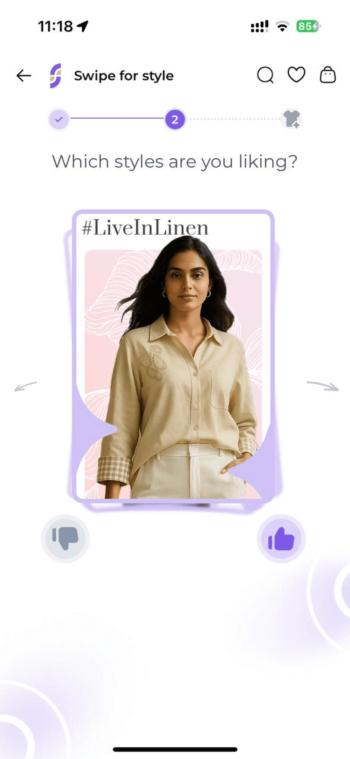
BINARY ACCEPT / REJECT

RECOMMENDATION
ERROR PREVENTION
03
PROBLEM
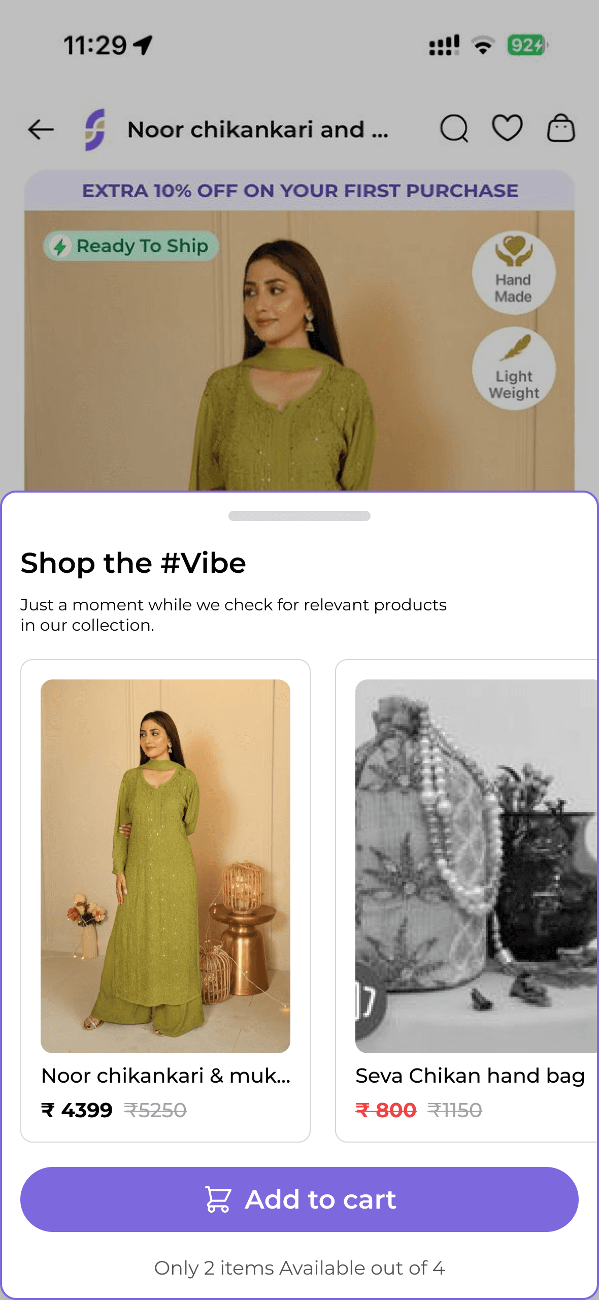
Users can add looks to cart with unavailable items.
EVIDENCE
Frustrating checkout experience when items become unavailable “Only 2 items available out of 4.”
BUSINESS IMPACT
Cart abandonment, negative user experience.
RECOMMENDATION
Real-time inventory validation for complete looks
"Find similar" auto-replacement for out-of-stock items
Priority hold system for users viewing complete looks

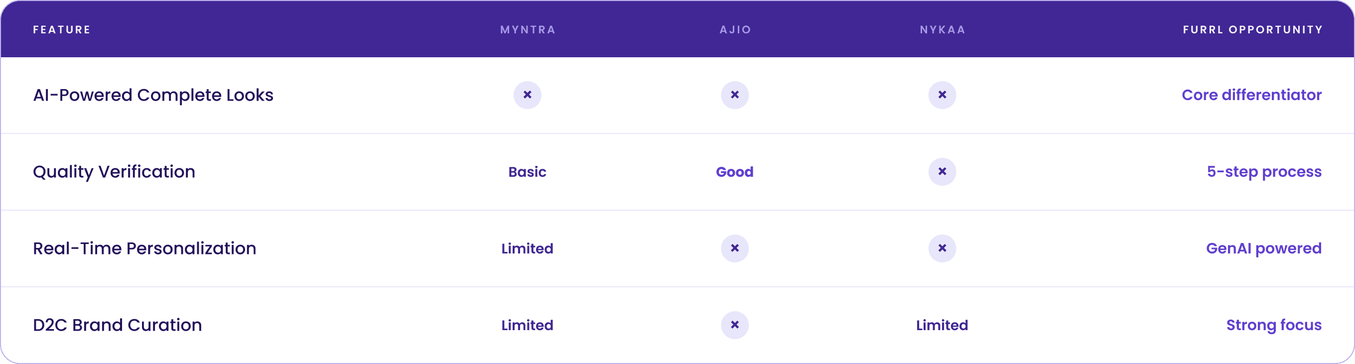
WHERE FURRL SITS IN THE INDIAN FASHION MARKET
Myntra
MARKET LEADER
STRENGTHS
Extensive brand portfolio (4,000+ brands)
Advanced recommendation engine
Strong logistics and return policy
WEAKNESSES
Overwhelming product catalog
Generic styling approach
Limited D2C brand focus
FURRL’S ADVANTAGE
Curated brand selection, AI-powered
complete styling
Nykaa Fashion
BEAUTY–FASHION BRIDGE
STRENGTHS
Strong brand trust from the beauty vertical
Influencer-driven content strategy
Premium positioning
WEAKNESSES
Limited AI personalization
Product-centric discovery model
Weak in homegrown brand curation
FURRL’S ADVANTAGE
Superior AI styling, stronger D2C brand focus
Ajio
TREND-FORWARD POSITIONING
STRENGTHS
Strong trend curation
Good social commerce features
Competitive pricing
WEAKNESSES
Limited personalization depth
Generic styling solutions
Weak quality assurance communication
FURRL’S ADVANTAGE
Deeper personalization, quality-first
approach
DESIGN STRATEGY
01
Solve the Specific Pain Point
Each change answers one named friction found in the audit nothing broader.
02
Leverage Existing Habits
Reuse patterns users already know from the app and the wider category.
03
Design for the Business Objective
Every flow decision ties back to trust, conversion, or average order value.
FEATURE REDESIGN 01
ORIGINAL UX LIMITATION
MY SOLUTION
BEFORE

AFTER
User Empowerment
System Transparency
FEATURE REDESIGN 02
ORIGINAL UX LIMITATION
The feature was confusingly named “Complete the
Look” and failed to provide a clear path to purchase
multiple items from one outfit creating a disconnect between the AI’s curated look and the actual shopping experience.
MY SOLUTION
Streamlined the entire flow to align with the business
objective of generating revenue: renamed to the
industry-standard “Shop the Look,” with a dedicated
shopping page for all items in a look.

BEFORE


AFTER
Clear Naming Convention
Renamed to the industry-standard “Shop the Look” to eliminate confusion and match the user’s mental model.
Dedicated Shopping Page
One organized view of every product in a look, so users can add multiple items to their bag lifting average order value.
SMALLER FIXES, MEASURABLE EFFECT
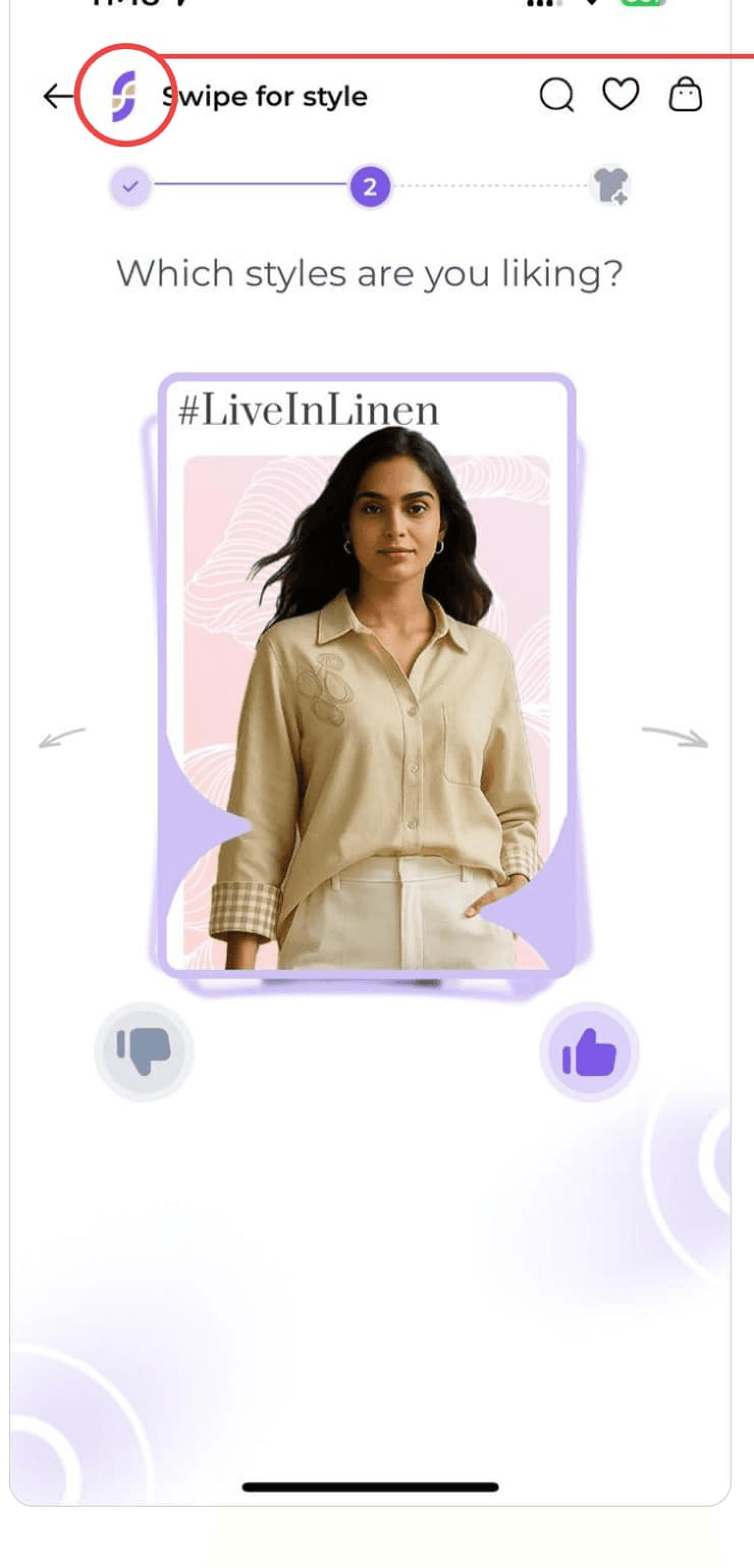
01 — BRANDING REFRESH
A logotype that matches the product
PROBLEM
SOLUTION
the same purple identity. Proposed a more dynamic, trustworthy logo direction built on
WHY IT WORKS
on the home screen, before any recommendation is seen. Brand recognition and first-impression trust are earned

BEFORE

AFTER
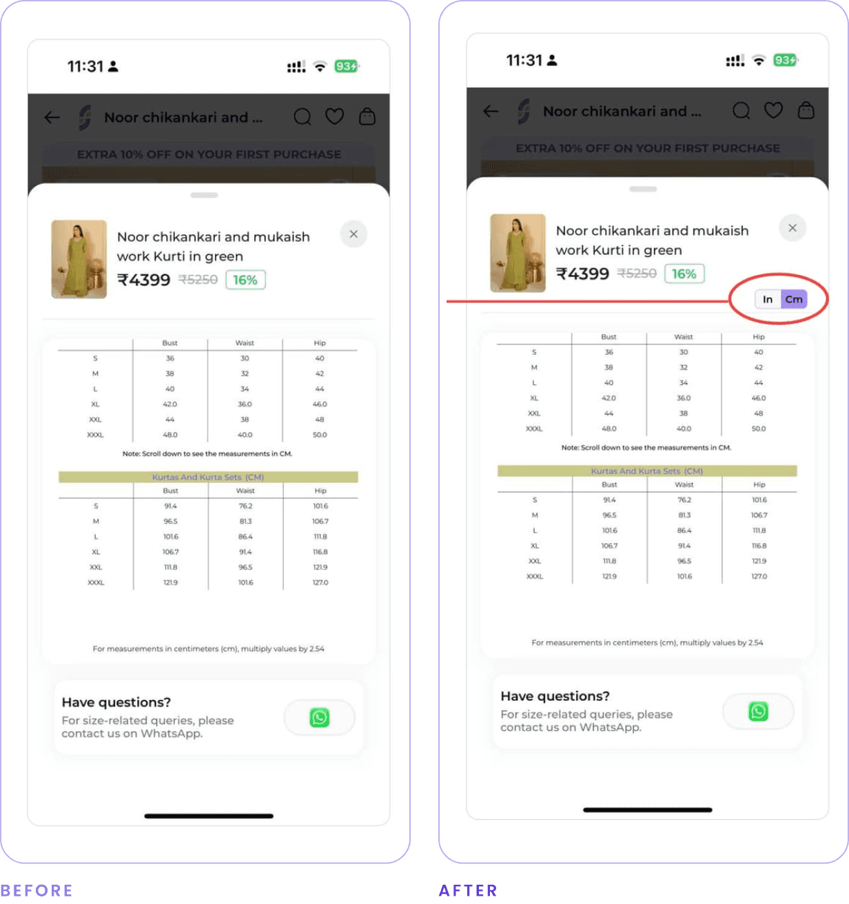
02 — SIZE CHART TOGGLE
Inches to centimetres in one tap
PROBLEM
The size chart required scrolling to a second table to compare inches and centimetres, interrupting the user’s flow.
SOLUTION
Switch at the top of the sheet. Replaced the stacked tables with a single In / Cm toggle
WHY IT WORKS
removing scroll removes doubt. Fit confidence is the last blocker before add-to-bag;
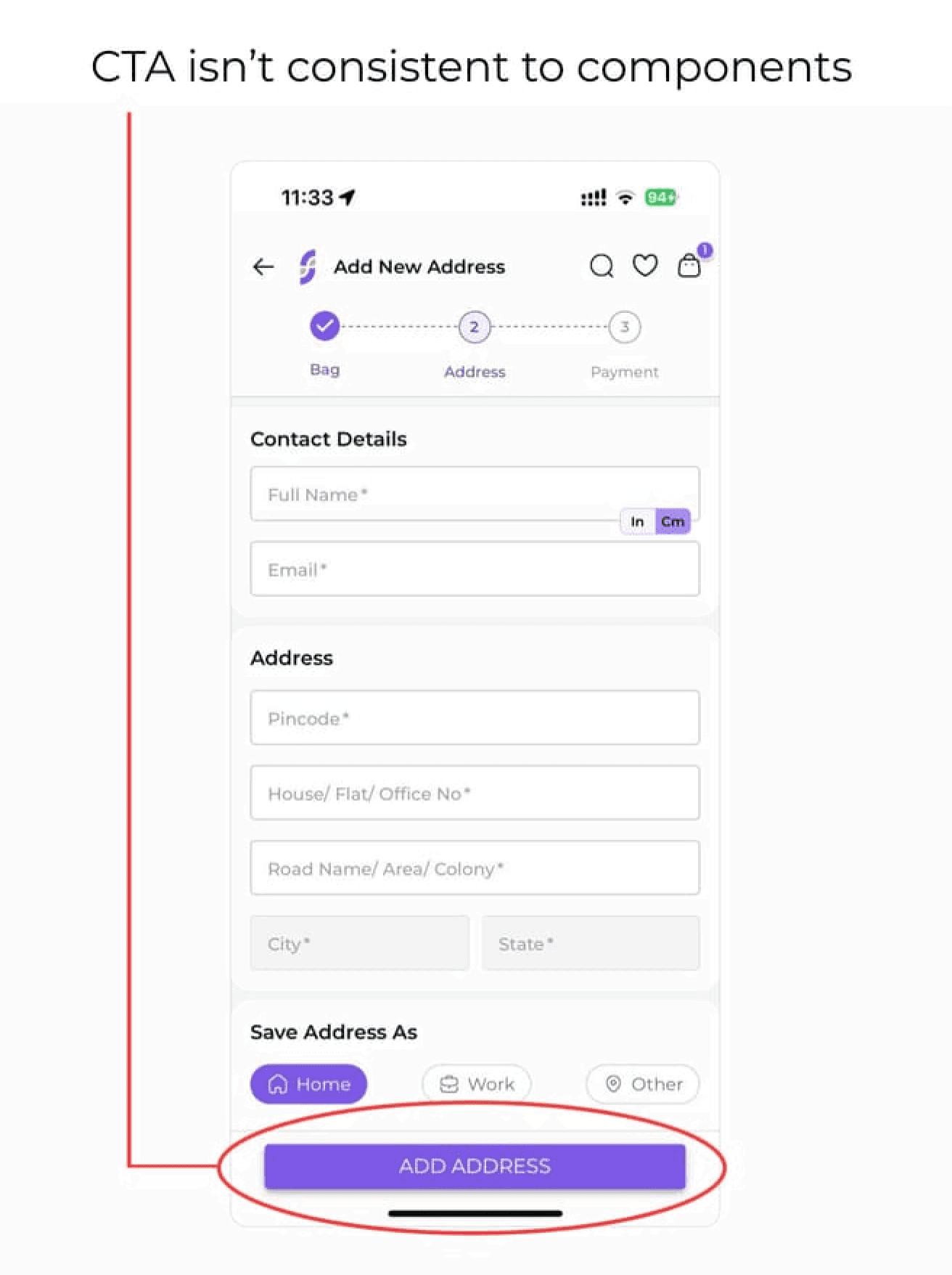
03 — CONSISTENT CTA STYLING
One button shape, everywhere
PROBLEM
screens, which makes the product look unfinished. Rounded and sharp-cornered CTAs were mixed across
SOLUTION
Screen in the flow. Standardised CTA geometry, weight and casing across every
WHY IT WORKS
A consistent primary action reads as polished and Professional and is faster to recognise mid-checkout.
04 — DECLUTTERED CHECKOUT
Protect the path to purchase
PROBLEM
Non-essential actions share on WhatsApp, email, wishlist, search, cart competed with the checkout flow and added cognitive load.
SOLUTION
Removed them from the checkout screens to focus attention on completing the purchase.
WHY IT WORKS
At this stage the objective is to reinforce the purchase, not to invite the user to save the item for a future one.

AUDIT ANNOTATION — COMPETING ACTIONS
REFLECTION
JASHAN DHINGRA — PRODUCT DESIGNER
Furrl