JS PORTFOLIO / WEBSITE REDESIGN / RENEWABLE ENERGY
WEBSITE REDESIGN
UI/UX
RENEWABLE ENERGY

ROLE
UI/UX Designer
CLIENT
GeoSolar (GeoPower India Pvt Ltd)
year stamp
2022-23
LIVE PROJECT
Full-page captures of the previous site and the redesigned site.
BEFORE
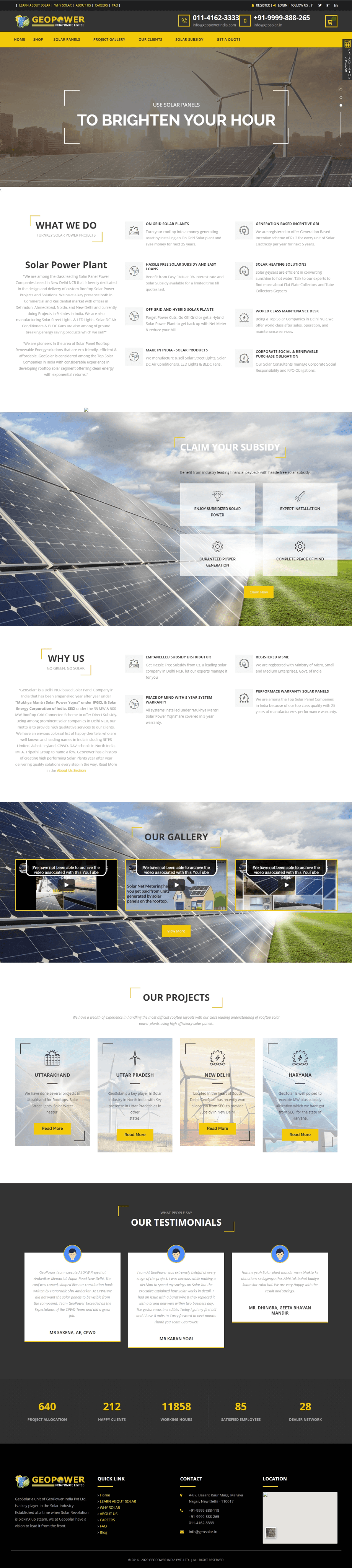
Previous design
AFTER

Redesigned site
01
THE BRIEF
What GeoSolar needed
OBJECTIVE
What was wrong with the previous site
Inconsistent typography mismatched fonts, sizes, and weights disrupting visual
hierarchy
Inconsistent container sizes for images and text blocks, creating a cluttered,
unbalanced look
Poorly organized structure and navigation pages not logically arranged, cluttered
menu
Outdated visual design with a dull color scheme and unengaging graphics
No interactive elements (community forums, project showcases, blog) limiting
engagement
GeoSolar at a Glance
Company facts drawn from the previous site's own content not website performance data.
10 states
Active project presence across India
Delhi NCR, UP, Punjab, UK
Office locations
Maha Ratna & Fortune 500
Client roster includes
Solar Street Lights & LED Lights
Also manufactured
02
APPROACH
Market and user research grounding a targeted redesign
MARKET RESEARCH
CAGR, 2021–2028
The global solar energy market is projected to grow at a
CAGR of 20.5% from 2021 to 2028, driven by technological
advancement, decreasing costs, and supportive
government policy.
Rising residential & commercial demand
Technological advancements
Growing environmental awareness
Government incentives
USER RESEARCH
participants, multiple regions
User surveys with 100 participants across different regions, covering both residential and commercial users.
Residential
Cost savings, environmental impact, ease of installation
Commercial
Sustainability goals, long-term investment value, reliability and efficiency
RESIDENTIAL INSIGHTS
COMMERCIAL INSIGHTS
Motivated by sustainability goals, long-term investment
value, and reliability/efficiency.
ACROSS BOTH GROUPS
Strong interest in community-driven solar projects, and a clear need for better product education.
DESIGN DIRECTION
Based on the research, the redesign focused on consistent typography, uniform layout containers, simplified navigation, a refreshed modern visual treatment, and new interactive/community elements while keeping GeoSolar's established yellow-and-black brand identity intact rather than replacing it.
REDESIGNED SITE PALETTE
#F4CA09
Signature yellow
#1E1E1E – #333333
Near-black nav
#FFFFFF
Base
PROCESS
01
Ideation &
Brainstorming
02
Design Principles
Simplicity, Clarity,
Accessibility
03
Wireframes &
Prototyping
Figma
04
Collaboration &
Feedback
05
Testing &
Development
WEBSITES REFERENCED DURING IDEATION
DesignVault
designvault.io
Behance
behance.net
Landingfolio
landingfolio.com
WEB DESIGN PRINCIPLE REFERENCES
Wix
HubSpot
03
CHALLENGES & SOLUTIONS
Five real obstacles in the redesign, and how they were solved
CHALLENGE
Integrating complex technical information
SOLUTION
Clear, concise design language with infographics and images; interactive FAQs and educational sections
CHALLENGE
Ensuring a seamless experience across devices
SOLUTION
Fully responsive design, tested across desktop, tablet, and smartphone
CHALLENGE
Balancing aesthetics with performance
SOLUTION
Optimized media file sizes without compromising quality; streamlined structure for faster load times
CHALLENGE
Encouraging community involvement
SOLUTION
Interactive elements — product and project showcases and a blog; integrated social media and easy contact access
CHALLENGE
Maintaining consistent branding
SOLUTION
Detailed style guide covering colors, fonts, and imagery;
enforced through regular design reviews
04
WHAT CHANGED
Five issues in the old site, and what replaced them.
BEFORE
AFTER
01
Inconsistent typography across pages
Unified typography system — consistent fonts, sizes, weights,
clear hierarchy
02
Inconsistent container sizes
Standardized container sizing for a balanced, organized layout
03
Poor structure and cluttered navigation
Reorganized site structure with a streamlined, simplified
navigation menu
04
Outdated visual design, dull color scheme
Refreshed modern visual design reflecting GeoSolar's
innovative brand
05
No interactive/community elements
Added community forums, project showcases, and a blog
05
Directional outcomes reported after launch no baseline analytics existed for the previous site.
✓
Enhanced user experience
Consistent typography, uniform containers, and improved structure made the site easier to navigate.
✓
Increased engagement
Interactive elements community forums, project showcases, blog boosted user interaction and time on site.
✓
Improved brand image
Modern visual design better reflects GeoSolar's innovative, forward-thinking positioning.
✓
Higher conversion rates
A more intuitive, engaging experience led to more inquiries and sales.
✓
Higher conversion rates
A more intuitive, engaging experience led to more inquiries and sales.
06
REFLECTION