
UX AUDIT & REDESIGN

ROLE
UI/UX Designer
OBJECTIVE
Fix UX issues across the Login Page, Signup Page and Artist Dashboard to create a seamless platform for managing music, tracking analytics, and distribution.
AUDIENCE
Independent artists and music creators

WHAT I FOUND
01
Login Page
5 ISSUES
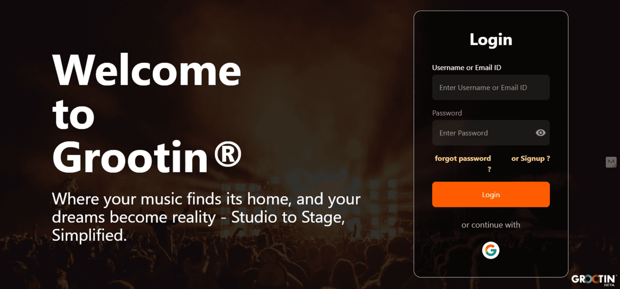
Header text “Welcome to Grootin®” broken awkwardly across three separate lines.
Cluttered, right-aligned login card crammed against the edge with a uniform 40px padding throughout.
Low-contrast yellow “forgot password?” and “or Signup?” links sitting beside each other; text and icons overflow their containers at low resolution.
Orange “Login” button undersized relative to the form weak visual hierarchy.
Confusing placement of the “forgot password” and “or signup” links.
02
Signup Page
4 ISSUES
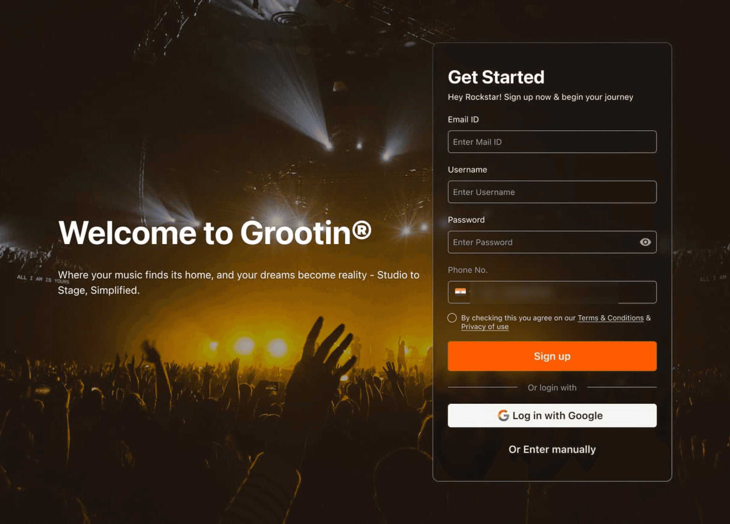
Inconsistent field styling and padding across Email, Username, Password and Phone Number, hurting visual hierarchy.
A “Verify” link floating next to the phone field with no instruction unclear whether “Create Account” also verifies the number.
“or Login?” placed awkwardly beside the Verify link, outside standard signup convention.
No password strength or requirement guidance.
03
Dashboard
8 ISSUES
No onboarding journey users are dropped in with no guidance.
No real dashboard just a bare “Upload Your Music Links” empty state, with no analytics anywhere.
“Profile” duplicated in both the nav bar and the menu bar, each opening a different page.
Cluttered profile info stacked in the centre name, location and genre crammed with no grouping.
Padlock icons on “Artist,” “Music” and “Royalties” with no explanation.
Top menu bar structure incomplete and confusing.
The “Upload Your Music Links” flow is unintuitive.
Colour contrast issues against the dark backgrounds.
WHAT I CHANGED
01 · LOGIN
BEFORE
AFTER
PROBLEM
SOLUTION
PROBLEM
SOLUTION
PROBLEM
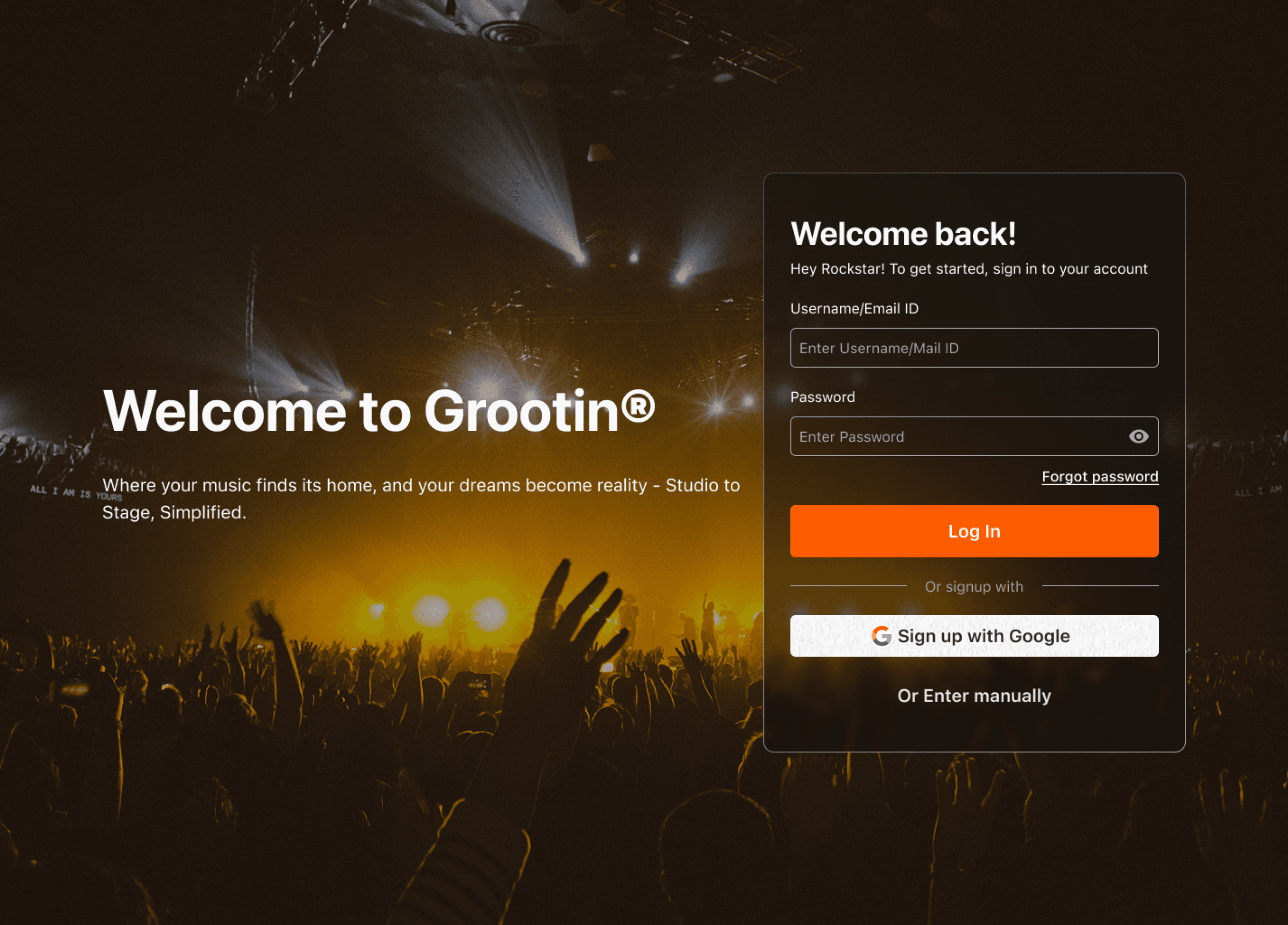
Alternate sign-in options had no separation from the primary action.
SOLUTION
A clearly separated “Or signup with” divider above a full-width “Sign up with Google” button and an “Or Enter manually” text link.
02 · SIGNUP
BEFORE

AFTER
PROBLEM
Inconsistent field styling; a bare “Verify” link floating beside the phone field, with “or Login?” jammed next to it.
SOLUTION
AFTER — STEP 2

03 · DASHBOARD
BEFORE

AFTER
PROBLEM
SOLUTION
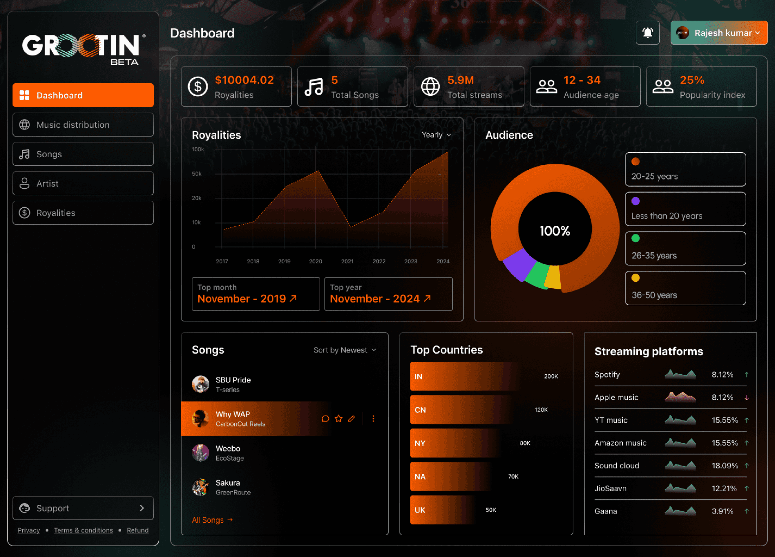
A full analytics view: royalties, songs,
streams, audience age, popularity index,
trend chart, audience donut, top countries
and platform breakdown.
PROBLEM
Padlocked nav items with no explanation.
SOLUTION
A clean sidebar — Dashboard, Music
distribution, Songs, Artist, Royalties — with
locked features labelled “Coming Soon” or
“Upgrade to Access.”
PROBLEM
Low colour contrast against the
dark background.
SOLUTION
The scheme was re-tuned against the warm
near-black so labels, values and chart
legends stay legible.
04 · PROFILE
BEFORE

AFTER

PROBLEM
Name, location and genre crammed together with no spacing,
tabs sitting directly under a dense info block.
SOLUTION
A structured layout with a large cover banner, avatar, and cleanly
separated Bio, Email, Music genre and Contact fields.
PROBLEM
“Profile” appeared twice in navigation, opening two
different pages.
SOLUTION
Collapsed to one destination with Basic Profile, Music, Video and
Events as distinct tabs.
REFLECTION
Summary
4
surfaces audited
17
issues documented
10
screens redesigned
