

TEKREANT DESIGN ASSIGNMENT
A caregiver dashboard for elderly patient
health monitoring.

ROLE
Product Designer
DURATION
Provided 48 hours, completed in 6 hours
TOOLS
Figma, Claude, Dribbble, Google, Figma AI
01
CONTEXT
Non-medical caregivers family members, companion caregivers, personal care assistants, homemakers and private duty caregivers need to monitor elderly patients' health effectively.
Today they struggle to track medication schedules, monitor vitals, manage appointments, respond to alerts, and access patient information.
i
Note on scope: the assignment specifies “an elderly patient” read as a
single-patient dashboard, not a multi-patient roster.
GOALS
1
Clear medication adherence tracking
2
Proactive alert identification
3
Centralized health monitoring
4
Simple appointment management
5
Easy access to patient information
02
Primary users Non-Medical Caregivers
Family / Informal Caregivers
Companion Caregivers
Personal Care Assistants (PCAs)
Homemakers
Private Duty Caregivers
Goals
✓
Monitor patient status at a glance
✓
Never miss medications or appointments
✓
Quickly identify alerts that need action
✓
Access patient information when needed
✓
Communicate with healthcare providers
✓
Peace of mind
Pain Points
✕
Not medically trained
✕
Information overload
✕
No single source of truth
✕
Anxiety about missing something critical
✕
Unclear when to escalate
✕
Multiple responsibilities
SUCCESS LOOKS LIKE
Caregiver can check patient status in under 30 seconds and immediately know if action is needed.
03
No Single Health Overview
Manual Medication Tracking
No systematic logging or reminders.
No Proactive Alerts
Caregivers must manually check for issues.
Cannot Interpret Medical Data
Scattered Appointments
No central location for scheduling and prep.
?
No Action Guidance
04
DECISION 01
Single-Patient Focus
WHY
The assignment implies one patient, and it's simpler for non-
technical users.
IMPACT
Cleaner interface, faster tasks.
DECISION 02
Simplicity-First
PRIORITIES
Visual clarity
Mobile-friendly
Plain language
Critical alerts first
05
Seven high-fidelity screens, from overview to task completion.
SCREEN 01
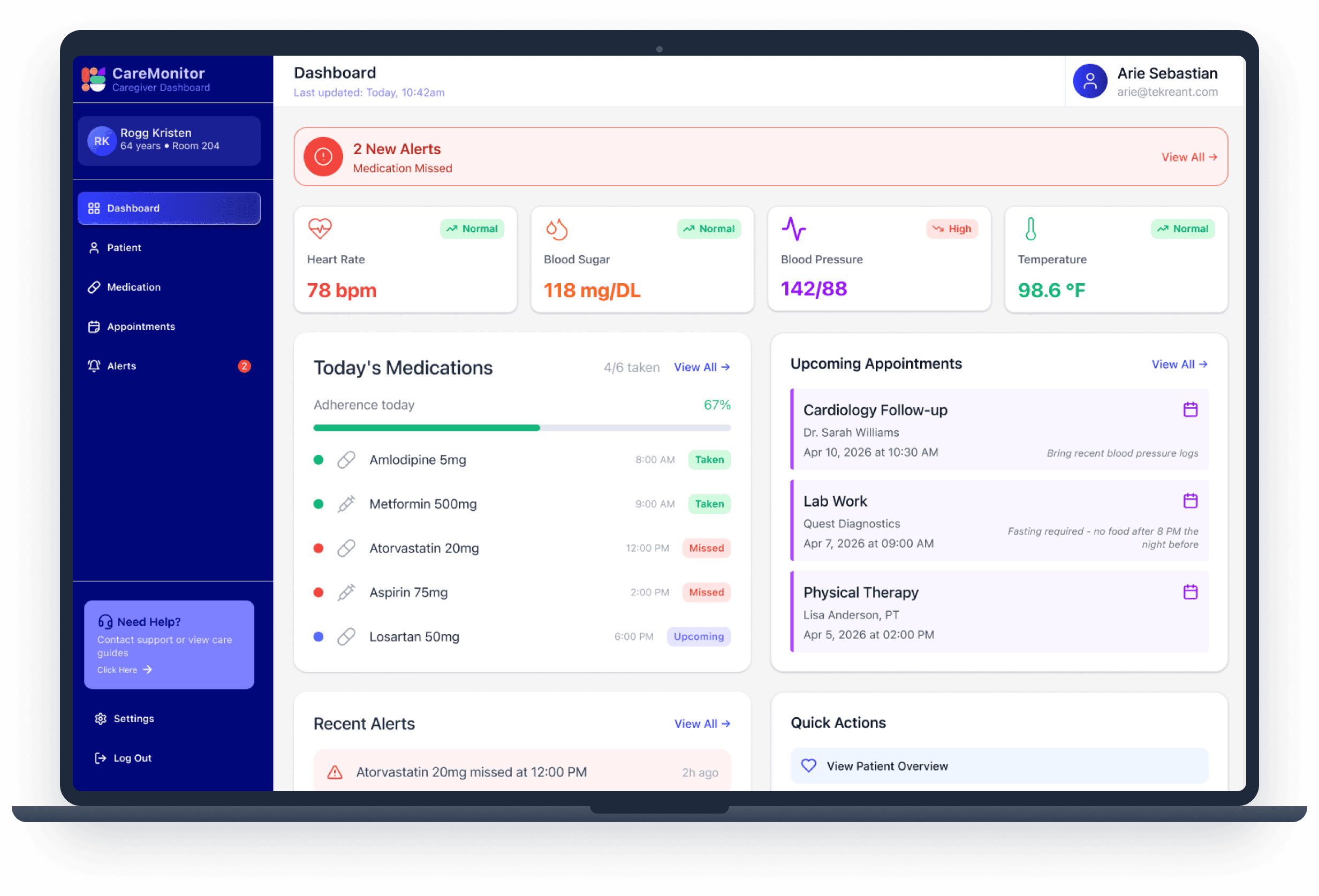
KEY ELEMENTS
Red alert banner 2 missed medications
Quick stat cards Meds 3/4, Appointments 2, Vitals High, Alerts 1
Today's medication timeline Taken / Upcoming / Missed
Upcoming appointments preview
Recent vitals with status Blood Pressure 142/88 · High
Why: everything critical is visible in under 2 seconds, with no scrolling for urgent info.
SCREEN 02

KEY ELEMENTS
Patient card — name, age, photo, blood type, room
Current vitals, color-coded by status
Personal info — DOB, address, emergency contact
Medical info — conditions, allergies, physician, current medications
Care notes
Why: all patient context in one place for emergencies or doctor calls.
SCREEN 03

KEY ELEMENTS
Overall adherence 88% — 30-day average with progress bar
Today's summary — 1 Taken, 1 Missed, 2 Upcoming
Individual medication cards — name, dosage, status badge, frequency, next dose, plain-language instructions, 30-day adherence rate
“Mark as Taken” button
Why: track which specific medications are problematic, and motivate adherence.
SCREEN 04

KEY ELEMENTS
Appointment cards: date, title, priority badge, doctor and specialty, time, location type, confirmation status, prep notes, quick edit action.
Why: prevent missed appointments and support better preparation.
SCREEN 05

KEY ELEMENTS
Summary cards for each severity level
Filter tabs — All / Critical / Warning / Info / Resolved
Alert cards — icon, title, description, timestamp, status
Color coding — red critical, orange high, yellow warning, green resolved
Why: never miss urgent issues; clear visual hierarchy.
06
01
02
Visual Status Over Text
✓
Green — good
!
Yellow — caution
✕
Red — critical
→
Blue — upcoming
Why: accessible to colour-blind users.
03
Critical Alerts Always First
Why: prevents missed emergencies.
04
Adherence Tracking for
Motivation
Why: visible progress motivates consistency.
05
Quick Actions on Cards
Why: 1 tap instead of 3–4.
06
Desktop-First Design
1440px screen width, Nav bar
Why: caregivers check status on the move.
07
For Caregivers
✓
Check status in under 30 seconds
✓
Never miss critical alerts
✓
Reduced anxiety
✓
Faster task completion
For Patients
✓
Better medication adherence
✓
Fewer missed appointments
✓
Earlier issue detection
✓
Improved health outcomes
CareMonitor Tekreant design assignment by Jashan Dhingra, Product Designer.
PROTOTYPE
CONTACT