JS Portfolio / B2B SaaS / Healthcare

STAKEHOLDER INTERVIEWS
In-Depth Interviews
Agency admins -> shift/job management
Facility managers -> compliance & oversight
HCPs → mobile workflow challenges
CAs → rate card & billing complexity
WORKFLOW SHADOWING
Observational Research
Manual shift fulfillment processes
Credential tracking bottlenecks
Communication gaps between stakeholders
How HCPs actually use mobile in clinical
COMPETITIVE ANALYSIS
Market Research
ATS & job board functionality
Shift management approaches
Mobile experience best practices
HCPs tracking strategies
INFORMATION ARCHITECTURE
System Mapping
Admin Portal ↔ Facility Portal
Agency Portal ↔ Mobile App
Data boundaries & role-based access
Multi-tenant architecture constraints
5 Core Insights That Shaped Design
1
2
3
4
5
PRINCIPLE
HCP-First
PRINCIPLE
Speed & Flow Optimized
PRINCIPLE
Role-Based Everything
Admins need control. HCPs need simplicity.
Different interfaces for different needs.
Multi-Tenant Architecture
Strict data isolation between agencies/facilities. Role-based access: Super
Admin → Facility Admin → Agency Admin → HCP. Unified design system. Shared
compliance & audit trail infrastructure.
User Flow
Admins create shifts & manage credentials via portals. Mobile app gives HCPs
shift discovery and real-time updates. All changes sync immediately, no stale
flow. Audit trail tracks every action.
Color Palette
Mobile App
The primary color used across the mobile app for buttons, links, inputs, and other interactive elements. It sets the overall tone and emotional feel of the app experience.

Admin Portal
The primary color used across the admin portal for buttons, links, inputs, and other interactive elements. It reinforces a functional, task-focused feel suited for internal workflows.

Components


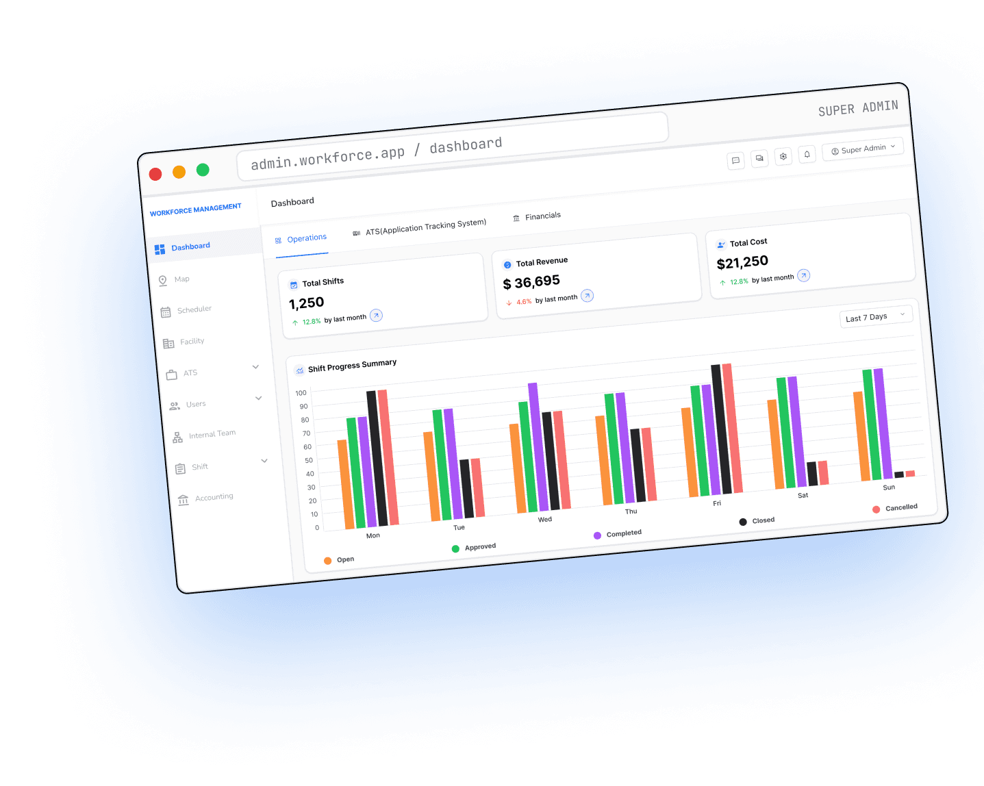
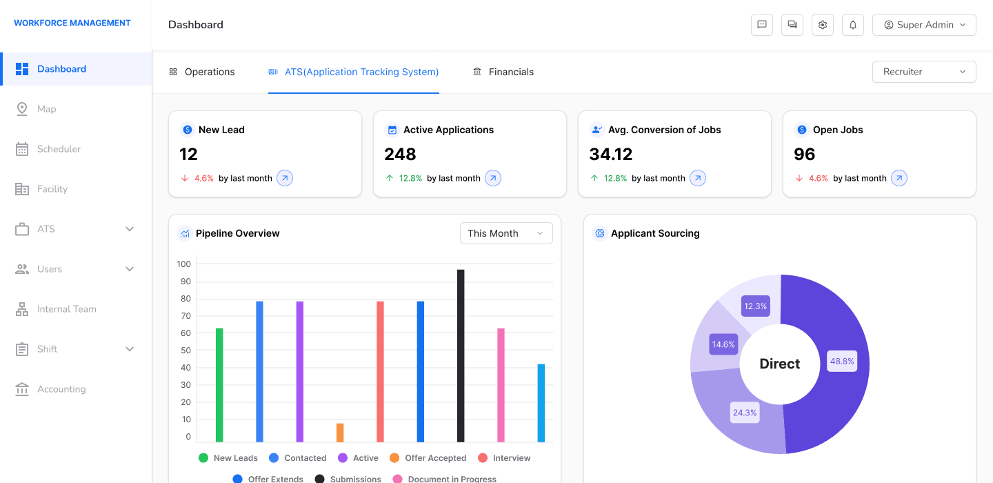
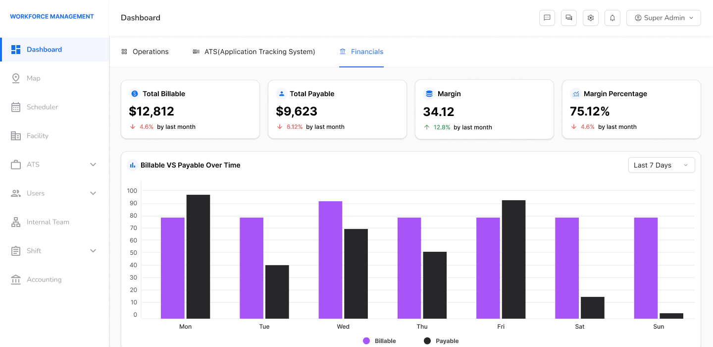
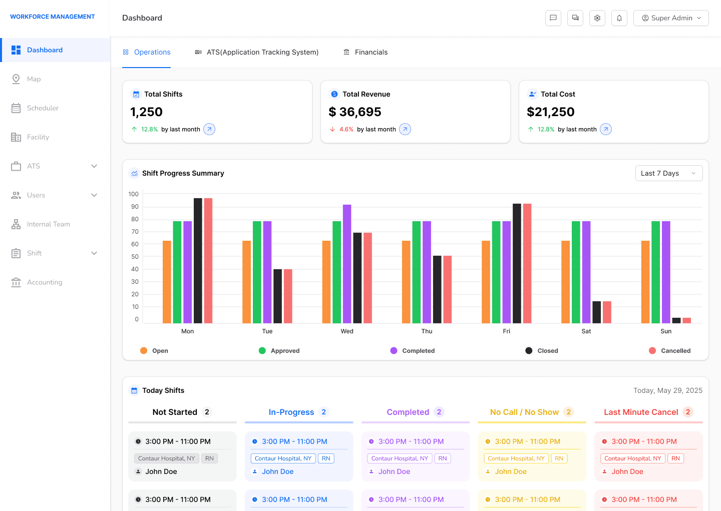
Real-time dashboards tracking shifts, jobs, credentials, invoices and users
Purpose & Users
The Admin Portal centralizes workforce management for
internal teams, facility admins, and agency representatives providing full operational transparency.
Super Admins
Manage system-wide configurations, user roles, platform settings
Facility Admins
Oversee facility-specific staffing, HCPs credentials transparency
Agency Admins
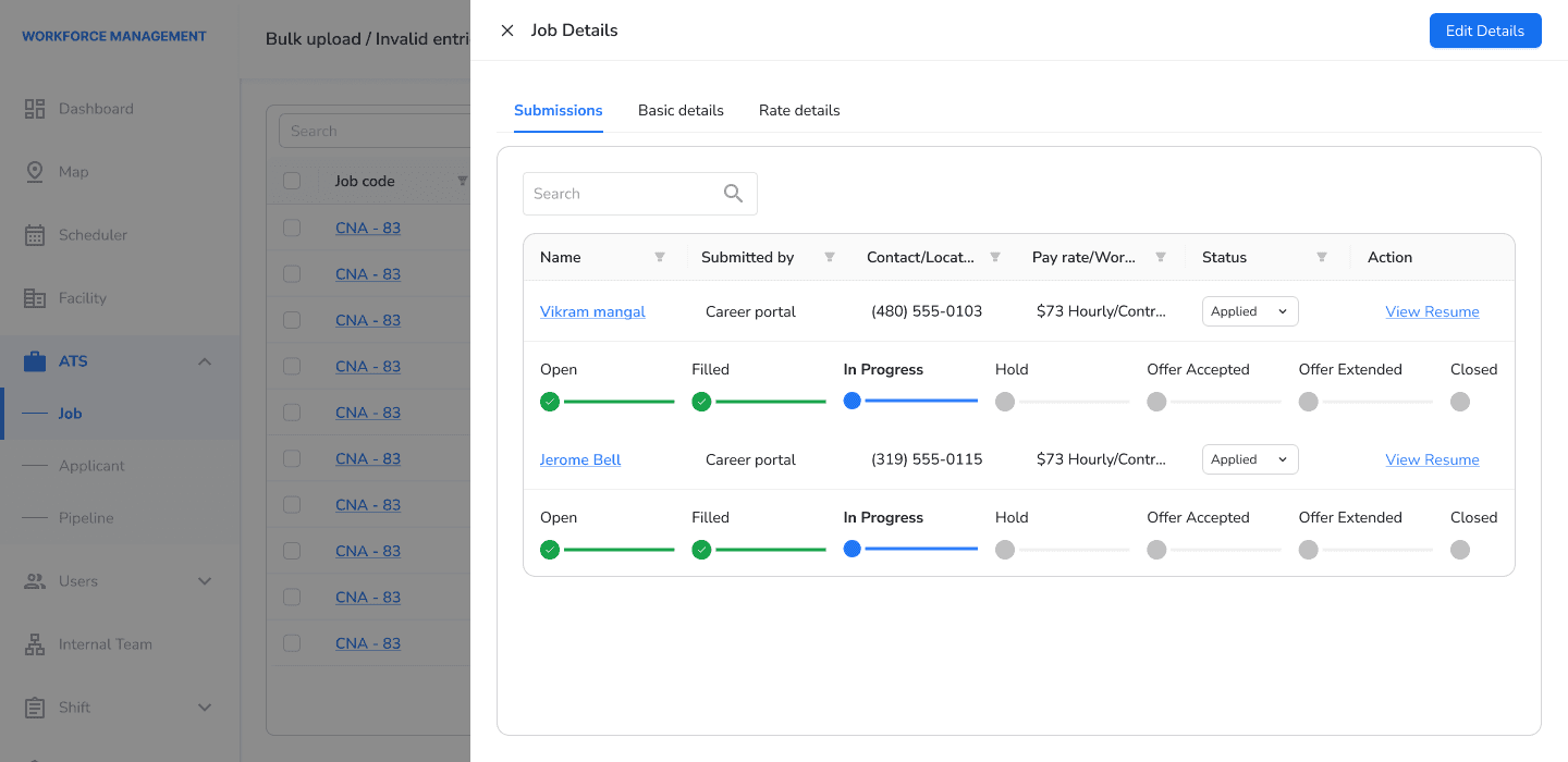
Manage HCP profiles, shift assignments, rate cards, facilities
Key Features
• Shift lifecycle management
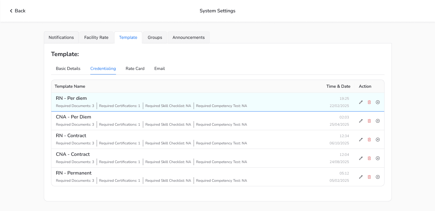
• Credential alerts
• ATS & Job Board
• Rate card system
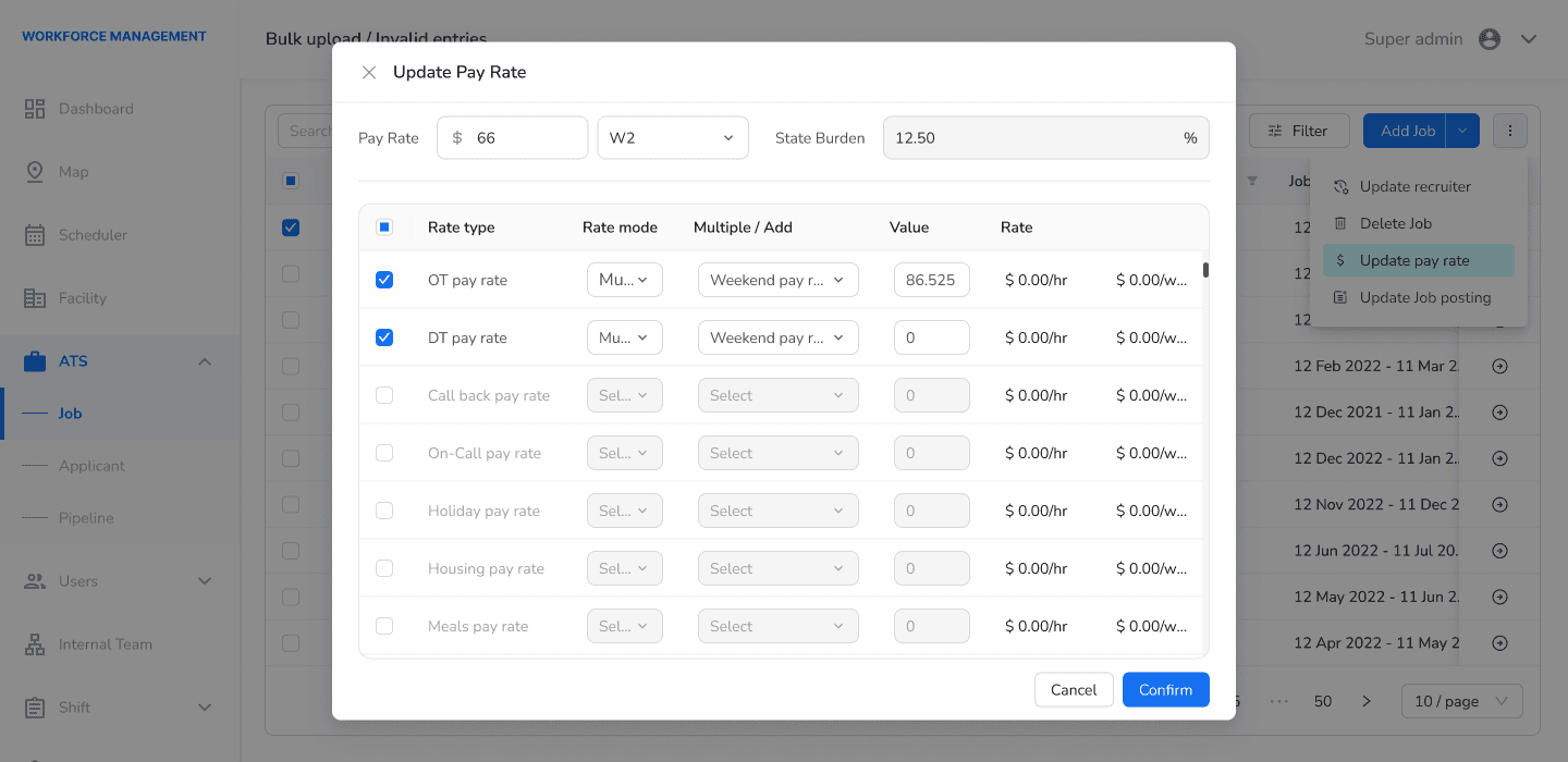
• Bulk operations
• Audit trails
Design Approach
The interface handles dense information using modular tabs, collapsible sections, and advanced
filtering. Bulk operations use multi-step confirmation to minimize errors.
1. Role-Based UI Views
Different admins see different interfaces based on permissions.
2. Progressive Disclosure
Show essential info first, expand only when needed.
3. Color-Coded Status Badges
Blue = Active, Green = Compliant, Orange = Expiring, Red = Critical.
4. Tabbed Navigation
Shifts, Credentials, Billing, Reporting, etc.
5. Advanced Filtering
Filter by facility, date, status, HCP type, state.
6. Bulk Actions with Confirmation
Multi-select → confirmation modal → execute.
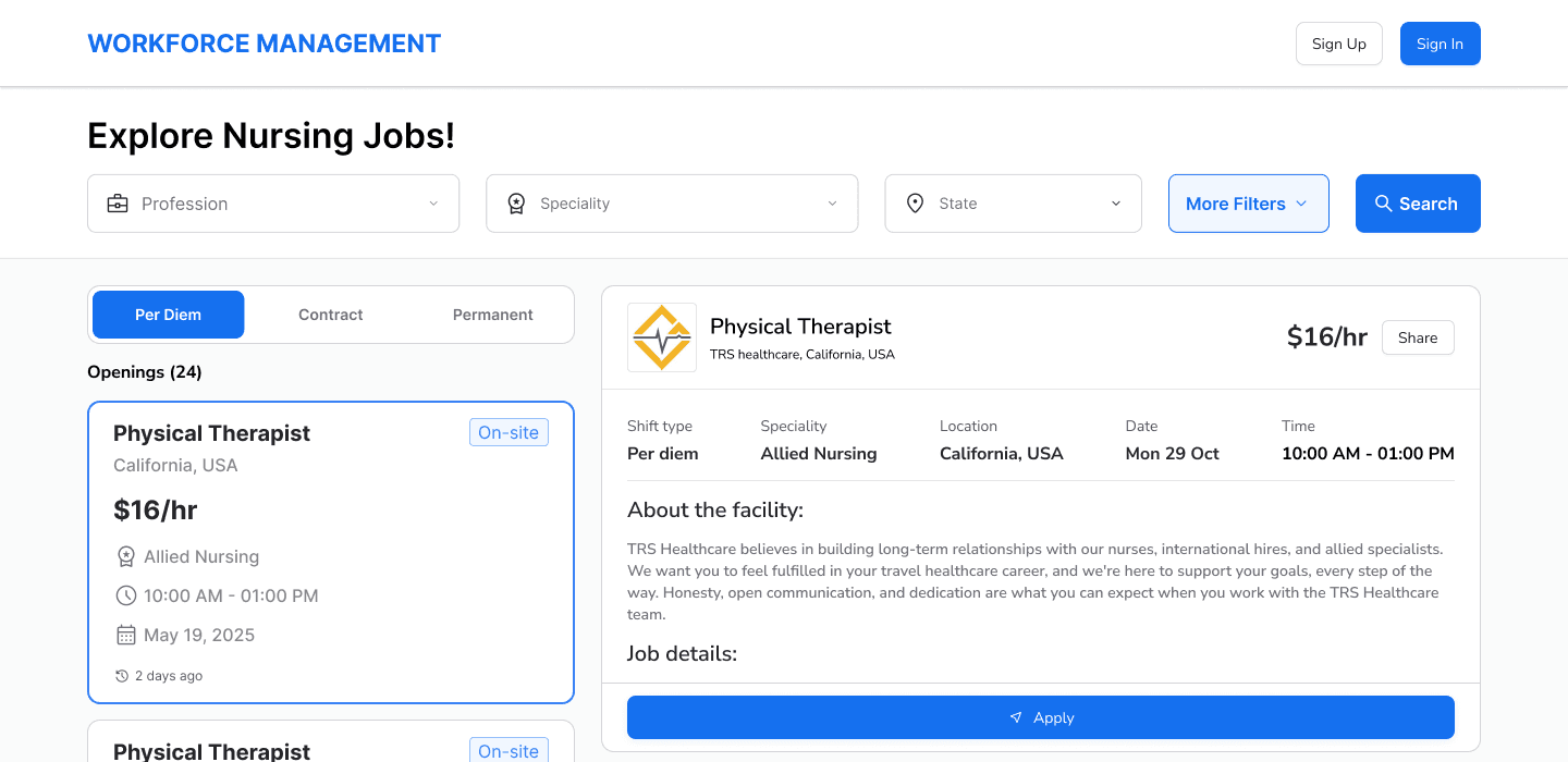







Streamlined shift/job discovery, application, and shift tracking
Purpose & Users
The mobile app equips healthcare professionals with
streamlined shift discovery, application, and real-time shift tracking feature’s tailored for clinical environments.
HCPs work fast-paced clinical shifts often between tasks,
wearing gloves, in bright sunlight. Every interaction must be quick,
large, and intuitive.
Key Features
• Smart shift discovery
• Shift & job tracking
• Clock in/out with breaks
• Credential management
• Profile & preferences
• Messaging & push notifications
Design Approach
Mobile UX prioritizes simplicity with large tap targets, minimal navigation, and visual feedback through multi-step processes.
1. Minimalist Screens
Only essential info per screen.
2. Large Tap Targets
Usable with gloves/wet hands.
3. Bottom Tab Navigation
Home, Search, Applications, Profile.
4. Step Indicators
Clear progress (Step 2 of 3).
5. Location Integration
Suggest nearby shifts using device location.
6. Push Notifications
Shift posted nearby, application updated, credential expiring.
7. Guest Mode
Browse shifts anonymously before login.


DECISION #1
Multi-Stakeholder Data Isolation
Challenge
Agencies can't see each other's data; facilities contracts with which agencies they want to work with.
Solution
Strict role-based access at every layer, UI surfaces only authorized data.
Why This Matters
Regulatory compliance (HIPAA), data protection, trust.
Design Impact
Faceted navigation, role-based dashboards, audit logs.
DECISION #2
Compliance-First Design
Challenge
Licensing is complex and error-prone; expirations create operational risk.
Solution
Automated expiration alerts, visual status indicators, centralized tracking.
Why This Matters
Prevents operational shutdowns, reduces manual work.
Design Impact
Credential dashboard is prominent; expiration dates visible everywhere HCP
appears.
DECISION #3
Scaling Through Automation
Challenge
Updating credentials for hundreds of HCPs one-by-one is tedious and risky
in bulk.
Solution
Bulk select → preview → confirm workflow.
Why This Matters
Admins saved 20–30 hours per week.
Design Impact
Multi-select checkboxes, preview modal, confirmation dialog.
DECISION #4
Different UIs for Different Users
Challenge
HCPs need speed; admins need power and density. Can one design serve
both?
Solution
No, build separate experiences optimized for each role.
Why This Matters
30% increase in shift applications; 25–30% faster fulfillment.
Design Impact
Mobile: bottom tabs, single-column. Portal: modules, tables, filters, etc.
DECISION #5
Shared Design System Across Four Surfaces
Challenge
Four different surfaces, each needing different UI patterns and density, but must feel like one product.
Solution
Single design system (components, tokens, typography) shared across all surfaces, adapted per context.
Why This Matters
Consistency at scale, faster feature builds, lower design/dev overhead.
Design Impact
Shared components/tokens reused everywhere; dense tables for portals, simplified single-column for mobile.
Multi-Agency Security
Trade-off
Feature parity across agency sacrificed for security.
Acceptance
Security > feature parity non-negotiable.
Healthcare Regulation
Trade-off
Simple UI vs. compliance checkboxes and audit trails.
Acceptance
Unglamorous features make the product valuable.
Time to Market vs. Perfect UX
Product needed to launch to secure clients.
Trade-off
No design system, features kept breaking product. → Full revamp over quick fix. → Rebuilt system to scale.
Acceptance
Diverse User Base
Trade-off
Single dashboard was overwhelming.
Acceptance
Role-based complexity is worth the adoption gains.
Design System Integration
Integrating new design system with existing code.
Trade-off
Incremental rollout meant temporary inconsistency.
Acceptance
Migrated one system at a time to full consistency.
✓ Secured 14+ clients through both Admin Portal and Mobile App
✓ Achieved 25–30% reduction in shift fulfillment times
✓ Improved compliance and credential verification rates by 30%
✓ Saved 20–30 hours per week for administrators through bulk processing
✓ Increased mobile app adoption by 30% after rewamp
✓ Reduced billing disputes through accurate rate card automation
Compliance-First Thinking Changes Everything
"In consumer SaaS, you optimize for engagement. In healthcare, you optimize for compliance and trust."
Design slows down, but mistakes are costly, audit trails and confirmations are essential.
Multi-Agency Architecture Isn't Just Technical — It's a Design Problem
"Building for multiple organizations with different security requirements bleeds into every UI decision."
Role-based views and permission-aware features require deep understanding of the data model.
Real Users Break Your Assumptions
"I assumed HCPs would use the app between shifts. Reality: locker rooms, wet hands, poor lighting(sometimes)."
High contrast, large buttons, minimal text, fast interactions.
Bulk Operations Are Mandatory for Scaling
"When you have 500 HCPs, one-by-one updates are impossible."
Design for batch operations from day one.
Data Boundaries Require Design Discipline
"Strict isolation means resisting 'just share this data' requests from product teams."
Say no to things that cross security boundaries.
Design System Is Infrastructure, Not a Luxury
"Without a design system, every feature required design cycles. With one, features scaled 3x faster."
Invest in system-building early, it pays dividends at scale.
Browse available shifts nearby
Shows you can identify a trust/conversion problem, not just a usability one. Adding a trust signal (X HCPs worked here) is a business-impact redesign, ties directly to driving applications, which recruiters read as product thinking, not just UI polish.
End shift accurately
Shows financial-UX sensitivity. Pay accuracy and a clear breakdown of pay and taxes is a high-stakes trust moment for gig workers, redesigning that shows you understand emotional stakes tied to money, not just visual hierarchy.
Applying to a shift and waiting for a response
Shows systems-level thinking, not just interface fixes. A 6–12 hour wait for shift confirmation is a backend/process problem, proposing AI-assisted review to match qualified applicants faster shows you can design solutions beyond the screen, tied to speed and business outcomes.
Building the operating system for healthcare staffing was complex, regulatory-heavy,
and deeply rewarding. Special thanks to the engineering, product, and compliance
teams who made this possible.
Want to talk healthcare tech, B2B SaaS, or product design? Let's connect.